Mac McGrew - Typo Graphic Magazine
Reprinted from
Typo Graphic Magazine
“The monthly magazine that type built”

Mac McGrew wrote over 300 articles for a variety of printing trade journals. Here is a discussion of his background which appeared in Typo Graphic Magazine during International Printing Week, followed by just a sample of a few of his short articles. The caricature of him with the typesetter’s “composing stick” became a regular hallmark of that publication, and as the Editors stated, “It has become a symbol of excellence in typographic thought and practice.”


M. F. McGREW

Meet Mr. Typography


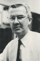
Here’s the real McGrew! 
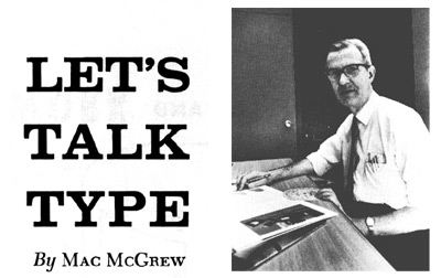
Months ago, Mac permitted the use of a caricature to head his column “Let’s Talk Type” in Typo Graphic. It has become a symbol of excellence in typographic thought and practice. Mac’s column has a large following. Sometimes we are asked for back copies. One reader recently suggested that we reprint his column in simple booklet form, for distribution among production people and others who value its textbook quality. (Maybe that’s a good idea. What do you think?)
      M. F. McGrew became fascinated with type and printing at an early age, probably inherited indirectly as his dad was an architect with a specialty of inscriptional lettering. He saved his money and bought a little hand press before he entered high school. Later, he worked in the composing rooms of several Pittsburgh print shops.
      He attended Carnegie Tech’s Department of Printing (now School of Printing Management) and operated his own commercial shop for three years. Then, he worked as layout and production man in a large shop for ten years.
      He was appointed type director in 1952 for Ketchum, MacLeod & Grove, Inc., Pittsburgh advertising and public relations agency. He has been president of the Pittsburgh Club of Printing House Craftsmen of which he has been a member for 27 years. His articles have appeared in The Inland Printer and Advertising Requirements.
      We are delighted to introduce you to the real M. F. McGrew at this most appropriate time—International Printing Week.
 
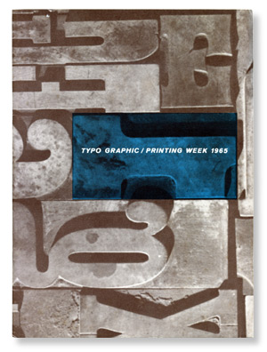
—Typo Graphic Magazine, January 1965, page 27


After we talked about f-ligatures last month, we were reminded of another group of special characters that are seen in reproductions of 18th and 19th century printing.
      These are the long s’s that were commonly used in early American type. They looked like f ’s, but with no crossbar or with only the left portion of the crossbar. It was customary to use the long s at the beginning of a word or within a word, but the short s as we know it was always used at the end of a word.
      Like the f ’s we mentioned last month, several long-s ligatures were also made. Although these are still made for Caslon and Baskerville, very few typesetters have the necessary matrices, and foundry sources no longer supply them.
      Substitutes can be made, for imitation period typography, by setting f ’s and painting out all or part of the crossbars as in the specimens. This requires considerable care, both in preparing copy for the typesetter and explaining what you want to accomplish, and in touching up the proofs. It is most successful in faces with long, overhanging f ’s.

      This set of long-s combinations is reproduced from the Monotype specimen book, where they are known as “Quaint Characters.” The same term was used by American Type Founders when the letters were available from that source. The word “sassafras” at the top of this column, demonstrating the use of the long s at the beginning and within a word and with a short s at the end, was set as “faffafras” and touched up.
 
—Typo Graphic Magazine, October 1969, page 1


Copy editing and proofreading are similar jobs, but with a difference. While the basic rules and procedures are the same, the difference should influence the way you go about them.
      Of the two, proofreading is more indispensable, but careful copy editing should be considered an economy rather than a luxury.
      We have seen much copy that rushes into typesetting without even being checked for ordinary typing errors. The typesetter may catch and correct the most obvious of these, but he has no way of verifying dates, the spelling of names, and many other details.
      All this should be done before copy is sent out, because corrections made on the copy cost little or nothing, while in type they become costly.
      When you mark corrections on a proof, you are actually writing instructions for changes to be made in type that has already been set. The type will not be reset except for lines containing changes; therefore corrections must be made in the margins where they can be readily seen, with only their locations indicated within the type area.
      Copy changes, though, may be written in place if they are simple enough — such as the insertion of a comma or an extra letter, or even a short word — because the typesetter has yet to set from the copy, going through it word by word and letter by letter.
      Some editors we know tend to go overboard in marking proofs, circling all the periods, putting carets over all the commas, etc. These special symbols are intended to make the marks unmistakable when they stand alone, but are superfluous when the marks accompany words in a natural way.
      But the folks who really do it the hard way are those who cross out all the suggested changes marked by the proofreader, and rewrite the same things their own way!
 
—Typo Graphic Magazine, December 1966, page 1


Where should the choice be made between all caps, caps and lower case, or all lower case?
      “Lower case” is printing terminology for small letters as distinguished from capitals. Unless otherwise indicated, this term would generally be understood to mean that ordinarily necessary capitals would still be used—the initial of the first word in a sentence, initials of proper names, first personal pronoun, etc.
      “Caps and lower case” means capitals for the first letter of each word, except—in best styles—articles, prepositions, or conjunctions of four letters or fewer. This style is still commonly used for newspaper heads, but is not often used otherwise, and may be considered obsolescent.
      “All caps” means just what it says, except that the c, ac, e, etc. of such names as McCall, MacLeod, LeRoy shall be lower case or small cap. This style should be avoided for long headlines, perhaps for all headlines, because caps are harder to read than lower case. All caps used in text for emphasis make a spotty appearance, and generally should be replaced with italic lower case or perhaps boldface lower case.
      All caps should never be used in text for publication names. Italic, or roman with quotation marks, looks much better. In contemporary usage (although the style books probably wouldn’t recognize this), publication titles often are given no special indication. This should be acceptable where no ambiguity can result.

*     *     *
Signed proofs are not only an indication that the right people have approved the type, but sometimes they’re life-savers when a job comes back for frantic last-minute revisions. Please!—never cut up signed proofs, never paste them on keys. Never send them out except for approvals or to the type house for further work. File them! Consider them sacred!
 
—Typo Graphic Magazine, January 1965, page 1